Jun 6, 2022
Do not be intrusive with popups on your website

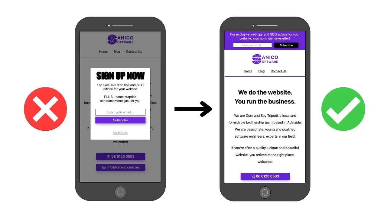
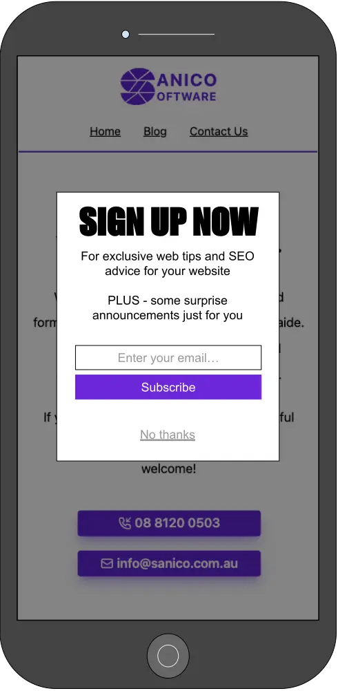
Website Tip #2: A very common strategy websites use is acquiring newsletter signups via email addresses. However, the mistake many websites make is in the form of large popup windows. What do I mean by large? It is large enough to disallow a user from accessing content on the page as seen in figure 1. These pesky popup windows sound good to prompt users but can actually have negative effects on the website’s search engine optimisation (SEO).
 Figure 1: An intrusive popup (dialogue) obstructing website content.
The other technical name for an intrusive element that obstructs content is referred to as an interstitial. Both interstitial and dialogues need to be approached in a non-intrusive manner.
But how can I prompt users without being slightly intrusive?
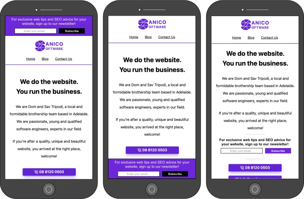
The concept of the newsletter signup is not negative, it is the disabling of user interaction with the website content that can get SEO rankings punished. Therefore, it is a great idea to implement elements such as banners on the website as seen in figure 2.
 Figure 2: Newsletter signup implemented with banners instead of an interstitial or dialogue.
These images serve purely as examples for the banners and are not a showcase of my design skills. They serve the purpose of showing how the user can still interact with the page content without being interrupted. The banner can still be emphasised as long as it does not obstruct the user.
The main difference seen between figure 1 and figure 2 is the position of the elements. Figure 1 intentionally blocks the content and forces the user to interact with it. Dare I say it is a selfish and attention seeking element. However, figure 2 integrates the element around the page or into the page giving a user the option to interact or scroll past.
What if I NEED an interstitial or dialogue for legal reasons?
That is a great question because some websites do need these types of elements. For example, particular businesses are bound by law to verify a user’s age before the content is displayed. However, Google understands this predicament and exempts these websites from its specific guidelines. There are a couple recommended best practices for these types of interstitials and dialogues which can found on Google’s Advanced Search Engine Optimisation (SEO) guide under Mandatory Interstitials.
Summary
Google creates these guidelines to help the public understand how to best develop your website. Custom designed banners are not always out of the box features within themes on website builders. Whether you are a developer like myself or an amateur designing a website, it is best to understand Google’s guidelines and be careful with how you prompt users.
That wraps up Website Tip #2, I hope this has helped you on your website journey. Also, be sure to check out our Instagram to stay updated.
